Building accessibility into a canvas-based product


Building on a canvas unlocks performance that a traditional HTML web app can't touch. It also strips away any accessibility the browser gives you for free. Here's how we built it back in.
Share Building accessibility into a canvas-based product
Illustrations by María Medem
Similar to a video game, Figma’s canvas takes over rendering from the browser to maximize performance. This lets us deliver powerful features like infinite zoom and real-time multiplayer. But because we don’t use traditional HTML and DOM to render Figma’s canvas, we don’t get any of the accessibility features that are built into the browser by default.
To make Figma accessible to more people, we created a Mirror DOM structure that could stay in sync with any Figma design. Here, we’ll go behind the scenes of how we made it possible for anyone to navigate a Figma file with a screen reader, hear changes as they’re announced, and operate the editor with a keyboard.

Learn more about Figma’s keyboard and screen reader accessibility improvements.
Synthesizing the DOM
Browser engines have a concept called the accessibility tree: a data structure distilled from the document containing the non-visual information needed for assistive technologies to work. When a screen reader user executes the “go to next form field” command, the accessibility tree tells the screen reader where to go. The browser builds this tree from DOM, semantic HTML, ARIA attributes, and some additional computed state.
In a typical web app, every component has its own DOM element like <button>, <p>, or <img>. But because Figma doesn’t use HTML for rendering, the canvas has only one <input> element that holds focus no matter how many layers are in the design. This meant that the browser’s accessibility tree was virtually empty for a Figma file.
To solve this, we added back synthetic DOM elements for the canvas so that screen readers could navigate and edit files.
How the system works
The scenegraph is the data structure of nodes that is rendered by Figma’s canvas.
Behind the canvas, invisible to sighted users, we render DOM elements mirroring the parts of the scenegraph that matter for assistive technology. There are four collaborating systems:
- A Figma-internal “accessibility tree” that caches the accessibility details of every design layer, and makes surgical updates rather than rebuilding from scratch as edits are made.
- A “Mirror DOM” React component that is responsible for actually putting elements into the DOM, using the internal accessibility tree as reference.
- A bidirectional synchronization system for selection. When you select a node in the canvas, the corresponding DOM element receives focus. Conversely, we update the canvas selection when screen reader tools are used to navigate the Mirror DOM.
- An announcement system that alerts the user to edits and other non-navigational changes—nudging, tool switching, and anything else that might be obvious to a sighted user.
The internal accessibility tree
To determine which DOM elements to render and how, we worked backward from what the browser should know in order to build its accessibility tree. So we built our own internal accessibility tree, which captures the non-visual information that screen readers would require for any given Figma document.
For each layer in the document, we create an “accessible summary” that will be read out by screen readers. This summary can depend on the context and what kind of application the user is in. For example, in prototypes, we can omit most of the editing features and only emulate the content to the end viewer: just the text of text fields, or a button role for an item with a click interaction. On the other hand, autolayout frames, which are excluded from the accessibility tree for prototypes, need to be included when the user is editing a document.
After summarizing layers one by one, we walk the tree top-to-bottom, flattening out any omitted nodes. While we fully construct our internal accessibility tree when first loading a document, we monitor edits as the session goes on so that we can surgically update our tree, avoiding costly rebuilds.

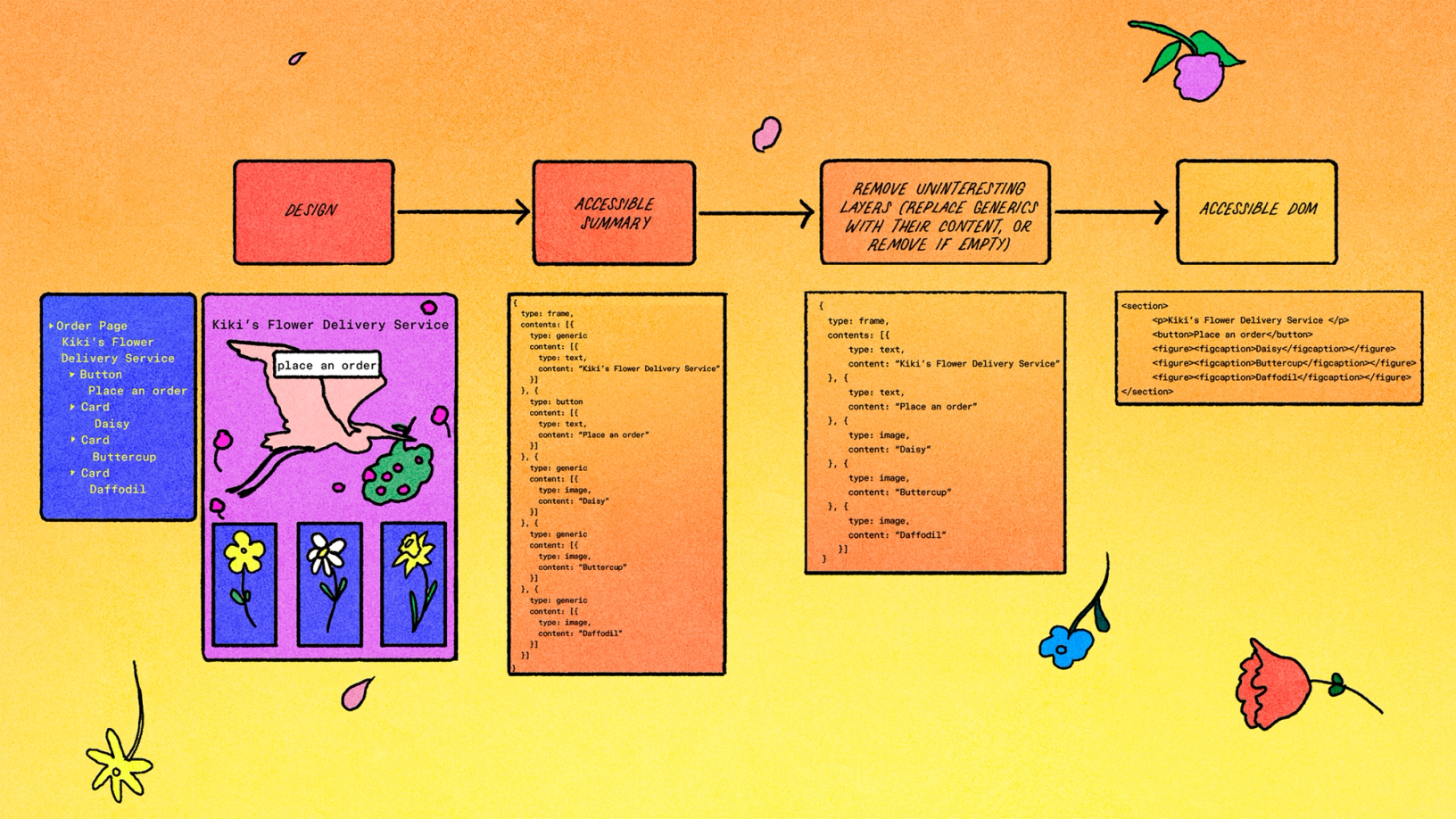
The Mirror DOM
With our accessibility tree ready, we can generate the DOM. This is handled by a React component that renders itself recursively, with each instance of that component subscribing to changes in the accessibility tree for one specific design layer.
function ScreenReaderElement({ layerId }: { layerId: string }) {
  const { label, role, children } = useAccessibleSummary(layerId);
  return <div role={role} ariaLabel={label}>
    {children.map((c) => <ScreenReaderElement key={c} layerId={c}>)}
  </div>
}
As we make minimal, incremental changes to the accessibility tree to track edits, we rely on React to keep our DOM modification minimal as well.
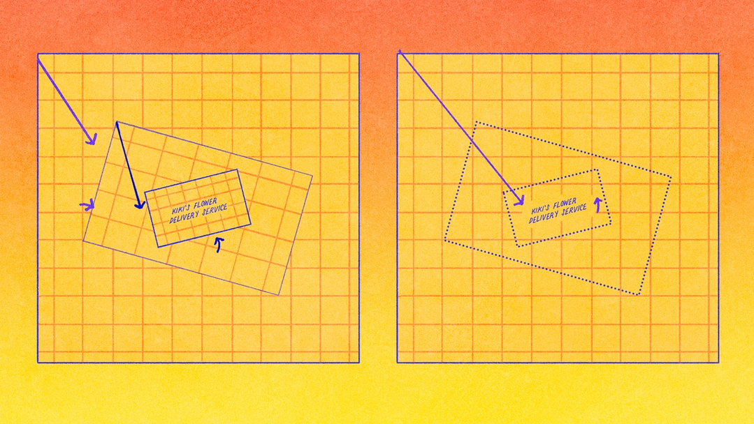
One detail of the Mirror DOM that might be surprising is that we don’t use typical visually-hidden styling for this accessible but visually hidden content. While such techniques allow for assistive technologies to interpret content without impacting the layout of the page, we actually need Mirror DOM elements to be laid out. The reason is that the spatial layout of a Figma document is critical to its meaning, and even without visual display the position of these elements feeds into assistive technologies—screen magnifiers might pan to keep the focused element in view; screen readers render a high-contrast outline for partially sighted users; voice control tools might also display cues on screen.
That positioning calculation has a few steps. Every layer in a Figma design has an affine transform: a fixed-size data structure that tracks offset, scaling, and rotation. Affine transforms are a powerful tool for computer graphics because any sequence of transforms can be concatenated into a single transform. We use those capabilities to position elements in the Mirror DOM using CSS, including any rotations or skews.

Keeping focus and selection in lockstep
Focus is a system keyboard property that denotes the element the user is interacting with at a given moment. For both screen readers and keyboard-only users, pressing the Tab key on a keyboard should move focus throughout the page in a way that matches the visual layout.
With the above features, we can support navigating prototypes and other “published” content with a screen reader. The next step was to support navigating “editing” applications in Figma. To do this, we needed to add back another thing that browsers usually handle for us: selection and focus semantics that assistive technologies can hook into.
The user’s selection is the item or items chosen for a given action, and may not always be the same as the element in focus (imagine selecting an item from a dropdown, and then using Tab to focus on a button to submit your selection).
When navigating in the Figma canvas, the Tab key changes the selected node without changing the system keyboard focus. This meant that the canvas looked like one big navigation target to screen readers. We needed to make sure that the focus moved to the selected node inside the canvas, the way users expect.
So, we built two-way synchronization—between the canvas selection and the system keyboard focus—into our Mirror DOM system. When you click on the canvas, the correct item is focused for the screen reader, and when a screen reader action moves the focus, we update the visible selection highlights. Because of this system, even screen reader controls such as the VoiceOver rotor are able to select nodes in the Figma canvas.
Announcing actions and changes
The internal accessibility tree and Mirror DOM systems expose the contents of Figma files to assistive technologies. However, these tools alone are not sufficient for editing, where the application must confirm a user’s actions back to them. Gestures such as nudging, whose results are obvious to a sighted user, need to also provide textual context that can be audibly announced. There’s really only one way to do this: We rely on live regions provided by web browsers as part of the ARIA standard.
Our implementation adds live region markup to every toast announcement in the product, and supports invisible announcements for events that would likely be perceived as redundant noise by sighted users—e.g., most users probably wouldn’t find it helpful to see a toast popup confirming every arrow key nudge, but these notifications are important for accessibility. We also handle automatic “coalescing”: If multiple events in the same category occur close together, we can merge them. Again using arrow key nudges as an example, if you nudge a single pixel five times in a row, we can send one announcement confirming “Moved five pixels” instead of repeating “Moved one pixel” five times.
What’s in place, and what’s next
To learn more about accessibility at Figma, visit our help center.
Our work to make Figma more accessible has grown over several years, shaped by feedback from users of assistive technology through our partnership with Fable. It started with the Prototype viewer in 2022, then FigJam in 2023, and finally we made significant progress over the course of 2024 and 2025: We rolled out the Adapt content for screen readers setting to Design, Dev Mode, and Slides, launched the first version of canvas keyboard controls Figma's new accessibility features bring better keyboard support to all creators. To make Figma easier to navigate for all, we’re launching over a dozen keyboard-only controls and improving the screen reader experience.
Who says design needs a mouse?

15+ ways we’re improving accessibility in Figma
We’re integrating accessibility into how we design, build, and ship new products. Every new feature is reviewed for accessibility support, and our team is also investing in internal tooling such as an AI agent equipped with Figma-specific context and guidance from the design systems team to help scale accessibility context across the entire Figma product development organization.
We also want to make it easier for people to build accessible products in Figma. Today, you can identify whether a color combination meets accessibility guidelines in the color picker and rename visible layers to pass those names to screen readers. And, we recently launched check designs, a new feature in Figma Design that gives designers a way to compare designs against their design system to surface what’s off and fix it in one click, including flagging low contrast and suggesting WCAG 2.0 AA- or AAA-compliant colors before handing off to engineering.
We're hiring engineers!
Learn more about life at Figma, and browse our open roles.
Accessibility work is never really finished. Each improvement helps remove another barrier, making it possible for more people to participate in the creative process, share their ideas, and shape the products we all use. We’ll keep listening, learning, and building toward a more accessible future.
David Winslow is a software engineer at Figma focused on accessibility and inclusive product development. He works on making complex collaborative design tools usable with assistive technologies, including screen readers. Prior to Figma, David worked on document viewing technologies at Google and contributed to open-source geospatial software projects.